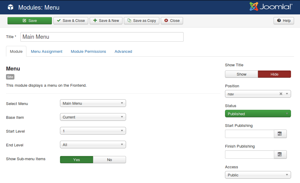
How to set up the main navigation of the template
Assign your main navigation menu module to the nav module position which is a special module position designed to be used only for the main navigation:
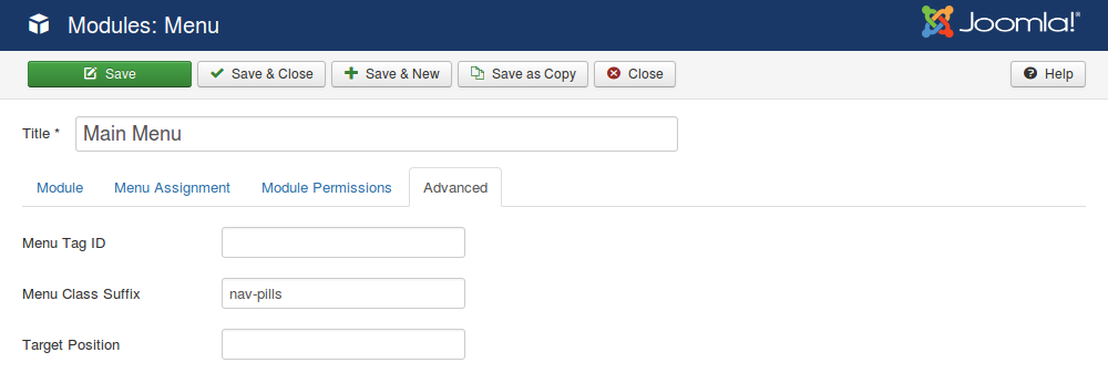
Make sure the nav-pills Menu Class Suffix is inserted in the Advanced Settings tab of the module:
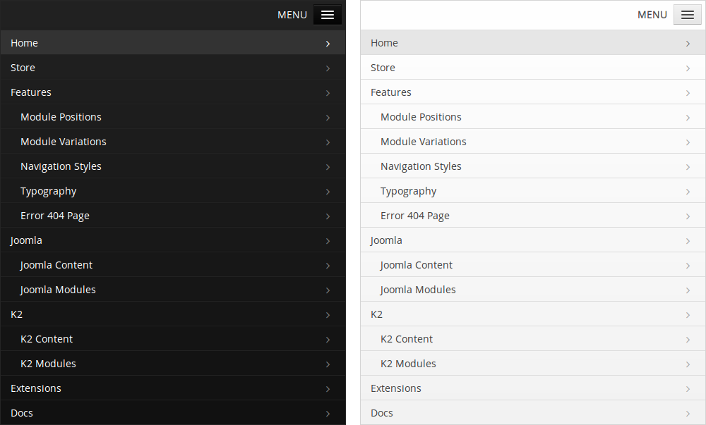
Being responsive, the main navigation adjusts to desktop, tablet and mobile with 3 different layouts. The tablet layout for the main navigation stacks the logo and main navigation on top of each other. The mobile layout for the main navigation uses Bootstrap's collapsing navbar and has both a dark and a light version:
How to use the template's settings (parameters)
The template settings are designed to help you customize the template for your project as quickly as possible. Find the template you downloaded from FavThemes in the STYLES tab of the Template Manager and access it. The template settings look like this:
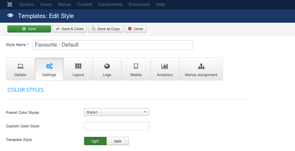
1) Details
This tab is the presentation tab for the template and has a short description of the template, with links to the demo and documentation and a preview image.
2) Settings
This tab controls the general settings of the template, the ones that let you customize the main elements such as the preset, custom and template color styles, the max width, the copyright info, the back to top link, the error page and the offline page.
3) Layout
The layout tab targets the main layout elements such as the background stripe image and module positions blocks: notice, topbar, slide, intro, lead, promo, prime, showcase, feature, focus, portfolio, screen, top, maintop, mainbottom, bottom, note, base, block, user and footer. Each one can be customized with background images and colors for the layout elements such as titles, text or links.
4) Logo
This tab was created to customize the 4 logo types supported by our templates: default, uploaded, text and retina logo. Each of them can be further customized with additional features such as slogan text, image alt, padding, margin or Google Fonts.
5) Mobile
Being a responsive product, the mobile behaviour of the template is a key element of the customization process. The tab for the mobile behaviour controls the style of the main navigation for mobile, the mobile images and the mobile font size for an improved reading experience on mobile devices.
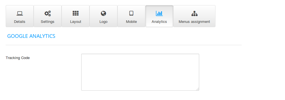
6) Analytics
Insert the Google Analytics tracking code inside this tab. Since SEO is an important element of any website, we've created this settings tab to make the Google Analytics setup for your website as easy as possible without any code changes that require editing the template files.
The settings tab
This tab controls the general settings of the template, the ones that let you customize the main elements of the website.
1) Color Styles
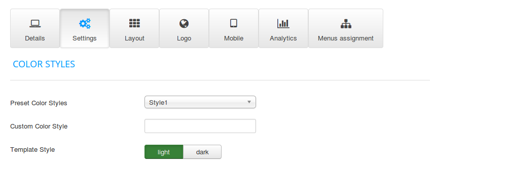
Choose between the 10 preset styles to customize the colors and appearance of the template or create your own.
The template style setting offers the option to choose between Favourite and Favourite Dark.
2) Maximum Width
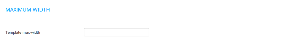
Set the maximum width of the template in pixels, percent or em. A blank field reverts the setting to the default value.
3) Copyright Info
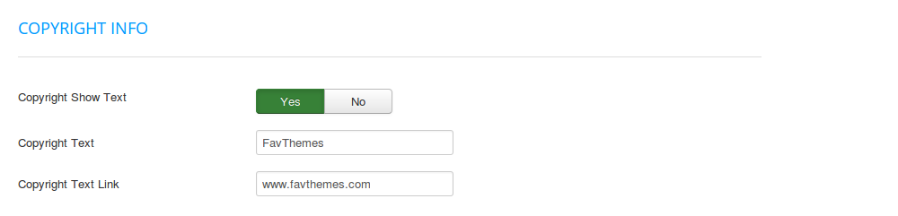
Choose if the copyright text should be displayed or not, insert the text for the copyright field and the link for the copyright field.
4) Back to Top
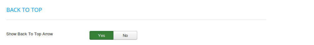
Choose if the button arrow for the back to top link should be displayed or not.
5) Error Page
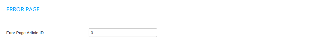
Insert the ID of the article used for the custom 404 error page. A blank field reverts the setting to the default value.
6) Offline Page
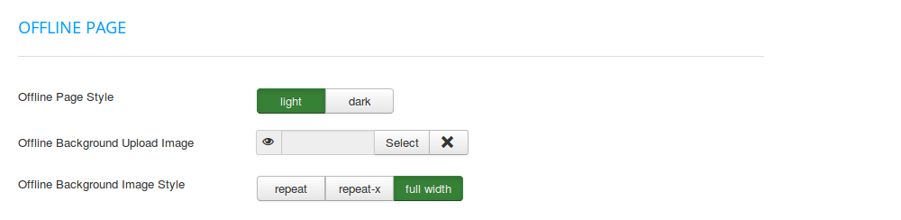
Upload the background image for the site when in offline mode and choose the style for the background image for the site when in offline mode.
The layout tab
The layout tab targets the main layout elements such as the background stripe image and module positions blocks which can be customized with background images and colors.
1) Background Stripe Image
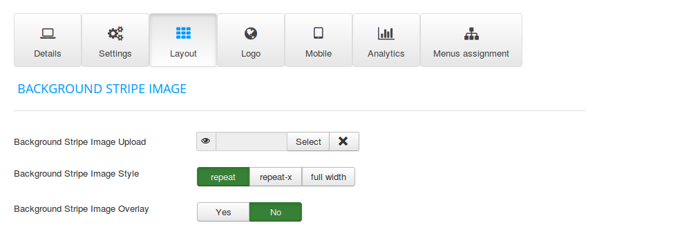
The background stripe controls the top/bottom image stripe which by default has a wood pattern element.
2) Notice
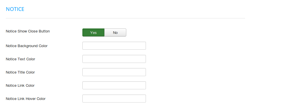
The notice element is designed for banners, promotions and advertisement space. To customize the notice element, choose if the notice close button should be displayed or not, choose a background color, text color, title color, link color and link hover color.
3) Slide
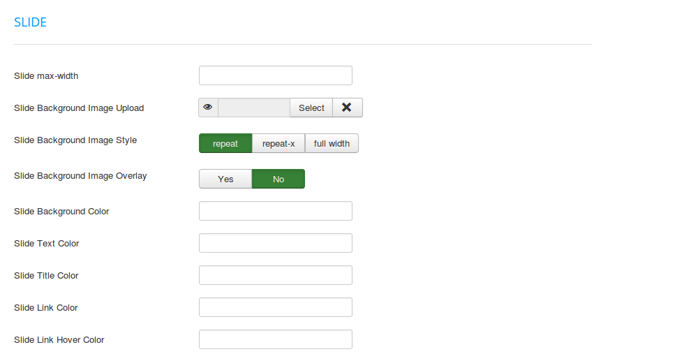
The slide element is designed for publishing the slideshow module and the slide images. The most important slide parameter is setting up the maximum width of this module position up to full width (100%). To customize the slide element, choose a background image, a background image style, a background image overlay, a background color, text color, title color, link color and link hover color.
4) Module Position Blocks
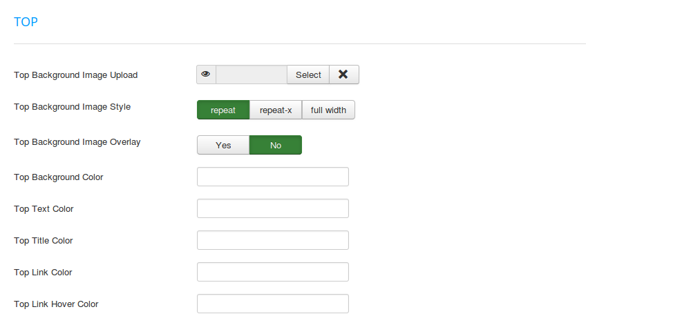
The module positions blocks are sections of the template and each one can be customized. If the notice, copyright and slide are special module position blocks with very custom functions, the rest of the module positions can be used for any type of content. Each of these module positions (topbar, intro, lead, promo, prime, showcase, feature, focus, portfolio, screen, top, maintop, mainbottom, bottom, note, base, block, user and footer) have the same set of parameters.
To customize the module positions blocks, choose for each of them a background image, a background image style, a background image overlay, a background color, text color, title color, link color and link hover color.
The logo tab
The logo tab was created to customize the 4 logo types supported by our templates: default, uploaded, text and retina logo.
1) Default logo
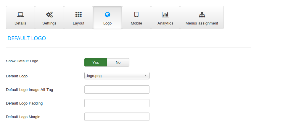
The default logo is the logo that comes by default with the template and can be changed from the files and folders of the template inside the Template Manager. To customize the default logo, choose if it should be displayed or not, the logo image, the logo image alt tag, the padding and the margin.
2) Uploaded logo
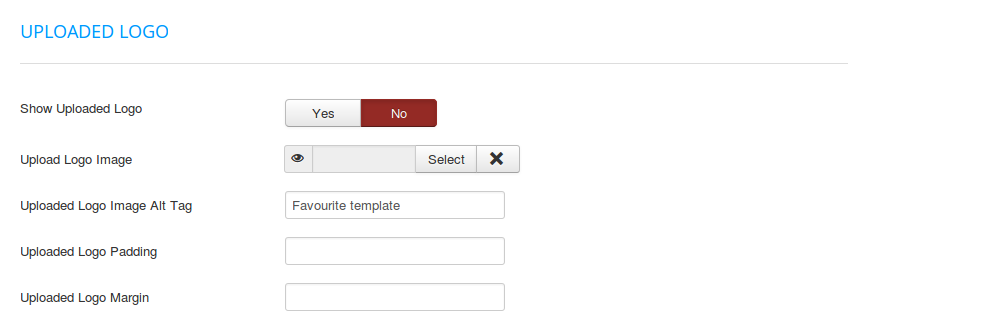
The uploaded logo type is designed to let you upload any image for your logo without editing the template files or using FTP. To customize the uploaded logo, choose if it should be displayed or not, upload the the logo image or set the logo image alt tag, the padding and the margin.
3) Text logo
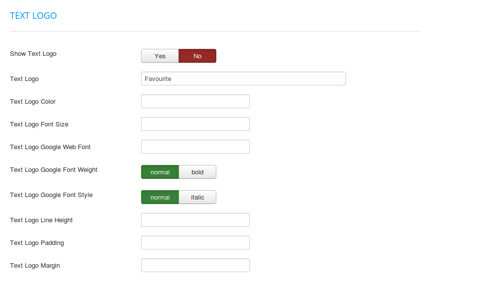
The text logo type is designed to be used instead of the logo image and can be styled with Google Fonts. To customize the text logo, choose if it should be displayed or not, the logo text, the color, the font size, the Google Font family, the Google Font weight, the Google Font style, the line height, the padding and the margin.
4) Slogan
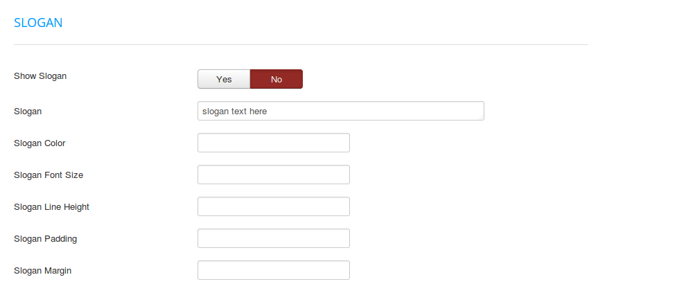
The slogan is designed to be used with the default, uploaded, retina or text logo types. To customize the slogan, choose if it should be displayed or not, the slogan text, the color, the font size, the line height, the padding and the margin.
5) Retina logo
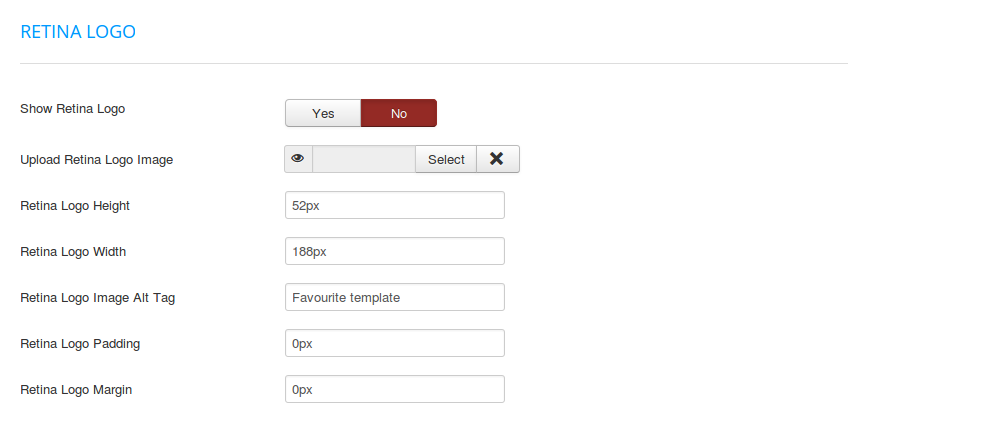
The retina logo is designed to be used as the logo image for devices with Retina Display and only for those devices, being a Retina version of the normal logo (either default, uploaded or text logo types). Both the normal logo and the Retina logo can be used at the same time, the normal logo will be visible on the normal display, while the Retina logo will be visible only on the Retina Display. To customize the Retina logo, choose if it should be displayed or not, the logo image, the height, the width, the image alt tag, the padding and the margin.
The mobile tab
Being a responsive product, the mobile behaviour of the template is a key element of the customization process. The tab for the mobile behaviour controls the style of the main navigation for mobile, the mobile images and the mobile font size for an improved reading experience on mobile devices.
1) Mobile Navigation
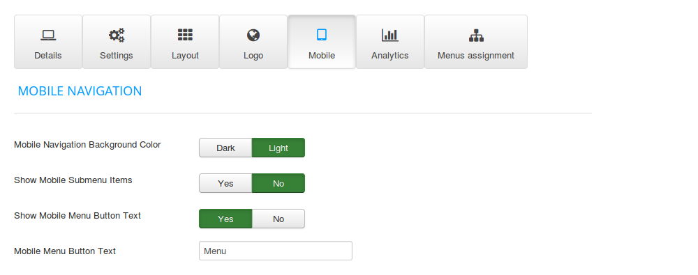
Choose the light or dark version for the mobile navigation, choose if the mobile submenu items and mobile menu text should be displayed or not and insert the text for the mobile menu.
2) Mobile Images
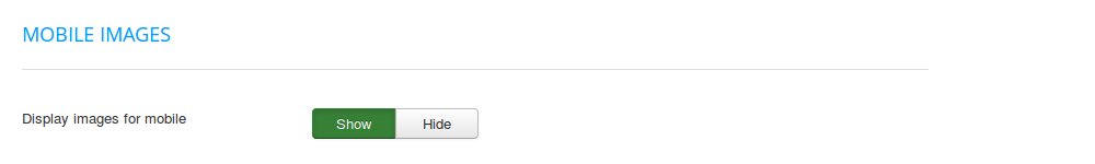
Choose if the images should be displayed or not on mobile devices.
3) Mobile Font Size
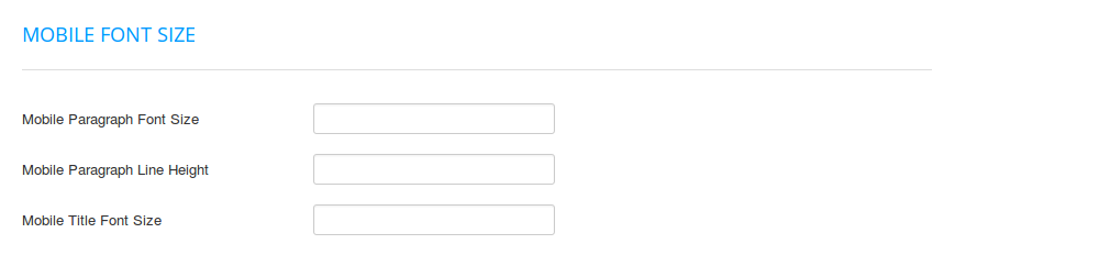
For an improved reading experience on mobile devices, choose the font size and line height for the paragraph text and the font size for the titles.
The analytics tab
Insert the Google Analytics tracking code inside this tab. Since SEO is an important element of any website, we've created this settings tab to make the Google Analytics setup for your website as easy as possible without any code changes that require editing the template files.
How to use the pull-left/pull-right Bootstrap classes
Use the Bootstrap classes named pull-left and pull-right to position horizontally 2 or more modules using the same module position.
To use them, insert the name of the class inside the Module Class Suffix field inside the Advanced settings of the module:
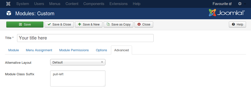
For these classes to work, you need to insert a space before the name of the class (by pressing the spacebar key from your keyboard).
The pull-left/pull-right Bootstrap classes cannot be used both at the same time for the same module, use either pull-left or pull-right.
How to use the visible/hidden Bootstrap classes
Use the Bootstrap classes named visible and hidden to hide/show different modules for desktop, tablet or mobile. These responsive utility classes are:
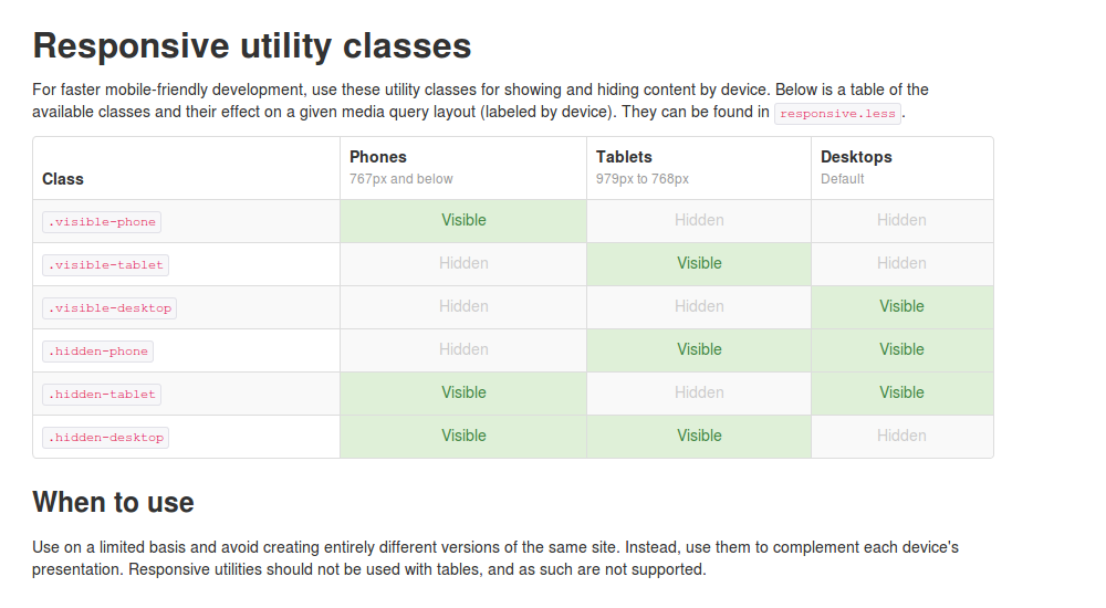
The screenshot is taken from the Bootstrap 2.3 official documentation, so please see the original source for the responsive utility classes documentation. Bootstrap 2.3 is the version that comes packed by default with Joomla! 3.x.
To use the visible and hidden classes, insert the name of the class inside the Module Class Suffix field inside the Advanced settings of the module:
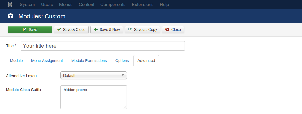
For these classes to work, you need to insert a space before the name of the class (by pressing the spacebar key from your keyboard).